Web Design Trends for June 2026
If you came here looking for inspiration, you might be slightly disappointed. "Trendy" doesn't mean "good," and in June 2026, the gap between those two things is wider than it's been in a while.
Here's the uncomfortable context: AI-generated websites now outnumber human-designed ones by a substantial margin. Statistically, trend data this year reflects what AI tools produce at scale, not what thoughtful designers are choosing. We wrote about this recently, and the patterns are hard to unsee once you know them. When the majority of new sites share the same visual vocabulary, that vocabulary becomes "the trend" whether anyone intended it or not.
So you can use this list as a guide to what not to do. Or you can adapt the ideas and make them genuinely your own. As Picasso is rumored to have said: "Good artists copy. Great artists steal."
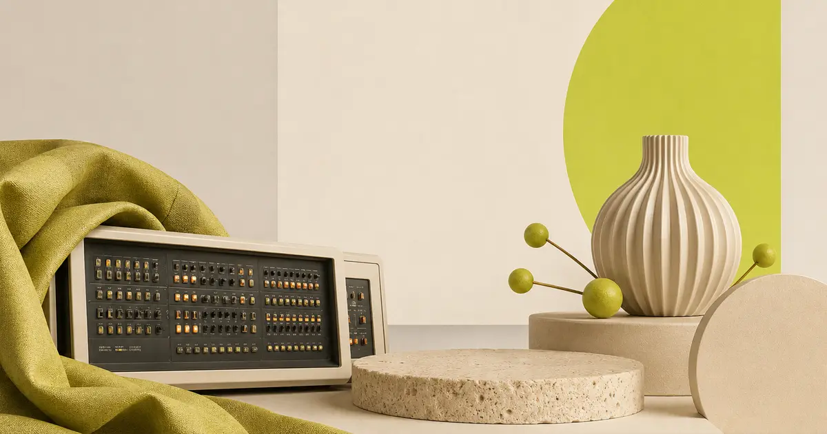
So, dear reader, here is the list. We compiled it with the help of our state-of-the-art UNIVAC 1108 mainframe computer. It thought, thought some more, and then spat out some punch cards. Here's what it said:
-
Purple-to-blue gradients. Every hero section. Every CTA button. Every decorative blob drifting behind a testimonial card. Purple on the left, blue on the right. Or blue on top, purple on the bottom. Sometimes the gradient runs diagonally, for variety. The AI has spoken on this matter, and it speaks in the same two colors. If your mockup currently contains this gradient, you have our sympathy and our understanding.
This is what we mean by purple-to-blue gradients. STOP THIS. -
Eyebrows on everything. A small, uppercase label floating above the headline of every section. "OUR APPROACH." "WHY IT MATTERS." "TRUSTED RESULTS." This is one of the clearest markers of AI-generated layout logic, and it has spread far and wide. The cure remains unknown. The prognosis is not great.
-
Floating social proof badges. "Trusted by 10,000+ teams" hovering in the hero, surrounded by a soft glow effect, like a spell cast to ward off skepticism. Sometimes accompanied by a row of unrecognizable company logos. The implication is that you're already late to something. You're probably not.
-
Oversized border radius. Every card, button, input field, and image container is rounded to the same exaggerated degree. Corners are not allowed to exist. Edges are afraid. This is not a design decision so much as a setting that was never changed. A rectangle, somewhere, is waiting for someone to let it be a rectangle.
-
The identical hero structure. Full-width background image or gradient. Centered headline. One-line subtitle. Single CTA button, usually the purple-to-blue variety described above. There are roughly 400 million websites on the internet. A growing percentage of them are this website. On a long enough timeline, all websites are the same website.
-
Inter, always Inter. Inter is a genuinely good typeface. It's also the default in Figma, in most design systems, in a significant chunk of the front-end component libraries people reach for. A rough estimate (and it is a rough estimate, not a peer-reviewed statistic) suggests something like 60% of new websites in 2026 are set in Inter. That's not a knock on the typeface. It's a knock on the absence of a decision. There's a whole world of type out there, and most of it is free.
-
Em dashes in the copy. The grammar of a model that is confident it is writing well. Thoughtful pauses. Rhetorical pivots. Confident asides. If your homepage copy reads like it has something to say and never quite gets there, check the em dash count. This one is well documented at this point.
-
Claude Design beige as a background color. Claude Design, Anthropic's AI design tool, has strong opinions about background colors, and one of them is a warm, creamy off-white that shows up on a remarkable number of AI-assisted sites. It's not ugly. It's the Agreeable Gray of web design: the paint color on the walls and the laminate flooring color in the kitchen of roughly half the new-construction homes in America over the last decade. Very few people hate it. Very few people especially like it. It doesn't offend anyone, and it doesn't interest anyone either. At this point it reads less like a design choice and more like a receipt from a specific tool.
This is Claude Design beige. It is very calm. Very safe. Very beige. You've seen this background color this week. Possibly on multiple sites. -
Bento grid layouts. Now for something genuinely worth paying attention to. CSS Grid being used as CSS Grid was always meant to be used: asymmetric cells, varied proportions, content that's actually organized rather than just stacked vertically like a tall list of facts. Partly inspired by the Apple product page aesthetic that's spread across the industry, bento grids at their best create a sense of considered structure rather than default rhythm. When it's done well, it's one of the most satisfying layouts on the web right now.
-
Dopamine color palettes. After years of "premium" meaning beige and off-white and barely-there minimalism, color is back and it means it. Warm oranges. Deep forest greens. Electric blues. Acid chartreuse that has no business being that confident. (If you're not picturing what chartreuse looks like, this is chartreuse: You're welcome.) These aren't aggressive choices; they're present ones. Brands that use real color in 2026 are choosing to be remembered, not reassuring. That's a shift worth noticing.
-
Expressive, architectural typography. Oversized headlines that structure the visual space rather than just label it. Extreme size contrasts between display type and body copy. Type used as a design element in its own right, not just a container for words. When this is earned and not just applied, it's genuinely exciting. A 180px headline over 16px body text is a spatial decision, not a font size decision. The designers doing this well know the difference.
-
Micro-interactions and purposeful motion. Small, considered animations that confirm actions, guide attention, and make an experience feel inhabited. Not decorative spinning. Not entrance animations on every paragraph. Motion that means something. The distinction between animation as polish and animation as noise is the whole game, and more designers are making that call correctly in 2026. A button that responds to a hover in a way that feels right is worth more than a full-page transition that nobody asked for.
-
Responsible glassmorphism. Frosted glass effects have matured past the "blur everything, add a white border, call it a card" phase. Used on one or two surfaces in a dark interface, with real attention to contrast and legibility, frosted glass can create genuine depth and useful visual hierarchy. The key word is "responsible." One frosted panel in a dark UI is elegant. A UI made entirely of frosted panels is a headache.
-
Dark mode as a genuine first choice. Not a toggle hidden in the settings menu. Not an afterthought generated by inverting the light-mode palette and hoping for the best. Sites being designed dark-first, with real attention to how contrast behaves differently in dark interfaces, how colors shift, and what emotional register a dark palette actually carries. Done well, it's not about being moody. It's about being intentional.
And That's the List
Some of these will look dated by September. A few will become the defaults that designers are still fighting against in 2031. That's how this works.
The only reliable rule in design trends is that whatever everyone is doing right now is the thing to approach thoughtfully, if at all. The items on this list that are good are good because someone made a real decision. The items that aren't are evidence of what happens when no one does.
Use accordingly.