The Telltale Signs of AI Web Design
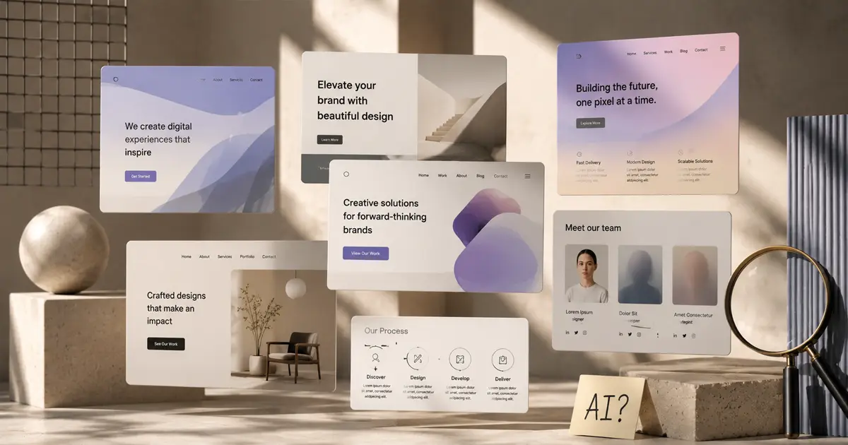
AI design tools have made it possible for anyone to launch a website on a Tuesday afternoon, ship it before dinner, and wake up Wednesday to real traffic. That's mostly good. Genuinely. The barrier to getting a functional, reasonably attractive site on the internet used to be either skill or budget, and in many cases it was both. That barrier is largely gone now.
But these tools leave a fingerprint. A visual and verbal signature that, once you've learned to see it, appears everywhere. On the landing pages of serious startups. On the portfolios of people who absolutely should have known better. On the redesigned sites of brands that paid for the tool and called it a day. You can't unsee it. You've probably already seen it today.
Here's what to look for.
The Eyebrow Epidemic
An eyebrow, in design terms, is the small label sitting above a headline. "CASE STUDY." "FEATURES." "WHY IT MATTERS." Used with restraint, it's a legitimate and useful pattern. It orients the reader, signals a section shift, and adds a bit of typographic hierarchy without demanding much space.
AI tools have decided that every single section of every single page needs one.
Scroll any AI-generated site and you'll find them stacked like receipts. Every headline is introduced by a label. Every label is doing everything simultaneously: different color, different weight, letter-spaced, sometimes italicized, sometimes a different font entirely. That's five typographic decisions where one would do.
AIs have a fever, and the only cure is more eyebrows.
The result is a page that feels perpetually over-announced. Nothing gets to just exist. Every section has to be introduced like a speaker at a conference. The irony is that when every section is labeled this prominently, none of them feel important. The eyebrow loses its purpose the moment it becomes automatic.
The Headline That Cannot Make Up Its Mind
Expressive typography is a real and valid approach. When it's done well, it guides the eye, creates rhythm, and gives a headline a point of view. One word in the brand color. A phrase in italic. A weight shift that functions like a pause.
What AI tools produce instead is expressive typography's anxious cousin: one word italic, one word in the brand color, one word bold, sometimes all three in the same headline, distributed more or less at random. The tool has learned that emphasis is good, and variation is expressive, without learning that these things only work when they mean something.
It's the same problem as someone who learned that exclamation marks create emphasis, and so now ends every sentence with one. At first it reads as enthusiastic. By the third paragraph it reads as noise. At some point it's all emphasis, which means there's no emphasis. The same logic applies to headlines where every other word is a different color or weight. The eye doesn't know where to land, because the designer (or the model) didn't decide where the eye should land.
Expressive typography requires a reason. Randomness isn't expression.
The Copy That Gives It Away
By 2025, the em dash had become the single most reliable signal of AI-written prose. Not because there's anything wrong with em dashes as punctuation, but because models reached for them constantly, in every clause, in every sentence, at a rate no human writer would ever sustain naturally. Readers who spent any time online started to notice. Some still flinch.
The em dash isn't alone. There's a whole vocabulary of tells: "It's not just X, it's Y." "Delve." "Dive deep." "In today's fast-paced world." "Game-changer." "Revolutionize." "At the intersection of." And the lists. Always five items. Exactly five. Never four, rarely six, always five, as if the model took a quiet vote and agreed that five is the number of a complete thought.
To be clear: there is absolutely nothing wrong with using AI to design your site. The tools are fast. The code they produce tends to work across devices on the first try, because responsive design is so thoroughly baked into their training data that they get it right almost automatically. A human who doesn't fully understand CSS can easily ship something that falls apart on a phone. An AI tool, in most cases, won't. That's a real advantage, and it would be silly to pretend otherwise.
The weak point is almost always the copy. A site designed by AI with copy written by a human who actually knows the business will almost always outperform a site where both the design and the words came from the model. The visual patterns can be forgiven, or even invisible to visitors who aren't designers. The copy is what someone actually reads. It's where trust either builds or doesn't.
What These Tools Get Right and Wrong
The case for AI site design isn't complicated. It's fast, it's affordable, and it works. Someone with a real business idea and no design background can now get a functional, attractive, mobile-friendly site up in an afternoon. The alternative used to be a six-week agency engagement they couldn't afford, or a template that looked like a template, or nothing at all. A lot of good businesses launched slowly or not at all because of that gap. AI tools closed it. That matters.
The responsive design point deserves emphasis on its own. Getting a site to look right on a 375px phone screen and a 1440px desktop monitor and everything in between is not trivial. Humans who don't do it for a living get it wrong in ways that are sometimes genuinely bad: text that overlaps, navigation that disappears, images that stretch into odd shapes. AI tools, trained on enormous volumes of correct responsive code, largely avoid these problems by default. That's a quiet advantage that rarely gets credited.
The case against is also real, though it's a different kind of problem. The issue isn't quality, exactly. It's homogeneity. Purple-to-blue gradients. Inter font, always Inter. Oversized border radius on every card and button. A floating social proof badge in the corner. The hero section structured identically on a thousand different sites: full-width image, centered headline, one-line subtitle, a single CTA. None of it is wrong. All of it is indistinguishable.
There's a concept in marketing sometimes called the broken window effect: if a customer notices a broken window in your building, they start, perhaps subconsciously, wondering what else you've been neglecting. A site that reads as templated, or generic, or clearly assembled from the same off-the-shelf components as every competitor, can work the same way. It's not that the site fails. It's that it raises a quiet question about whether the people behind it are paying attention. That's not always a fair inference. But it's how it reads.
So What Do You Actually Do With This
Use the tools. They're good. Get the site up. Enjoy the part where the mobile layout works correctly without three rounds of revision.
Just own the parts that are yours to own: the copy, the brand voice, the decisions about what your site actually says and, equally important, what it doesn't say. No AI tool knows what makes your business different from the seventeen other businesses that exist in your category. You do. That's the thing worth putting on the page.
A site that looks like everyone else's isn't a bad site. It's just a missed opportunity.