Kebabs, Eyebrows, and Rails: Your 2026 Essential Guide to All The Web Design Terms and Slang
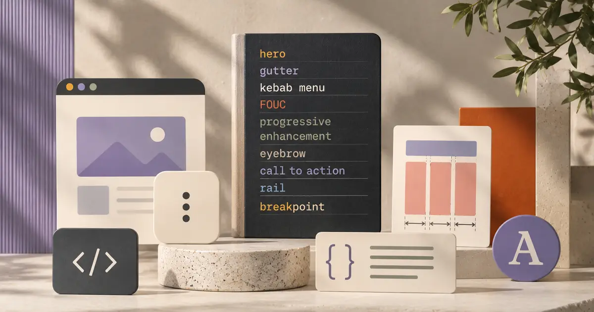
If you've spent any time in a design review, a Figma handoff call, or a Slack thread with a front-end developer, you've probably encountered at least one term that made you nod slowly while frantically googling under the table. That's fine. This industry has accumulated a strange, layered vocabulary, part old-school print, part interface lingo, part inside jokes that somehow became official. This glossary covers all of it: the foundational terms, the jargon, and the ones with names like "kebab" that you will definitely use at a party and immediately regret.
Layout and Structure
Before anything else, you need to understand how the page is organized. These are the structural bones.
- Above the fold
- What the user sees before they scroll. The phrase comes from broadsheet newspapers, where anything below the physical fold was secondary. On the web, "the fold" moves around depending on the device and browser window, which means designing only for above it is a trap, but it still matters because it's what earns the scroll in the first place.
- Hero
- The big, prominent area at the top of a page: usually a bold image or video, a headline, and a call-to-action button. It's called a hero because it does the heavy lifting. If your hero is weak, the rest of the page has to work twice as hard.
- Gutter
- The space between columns in a grid, or between cards in a layout. Gutters are why your content doesn't look like one solid wall of information. Ignore them and everything mushes together. Too large, and the layout falls apart. Getting gutters right is genuinely underappreciated work.
- Whitespace / negative space
- Empty space used on purpose. It doesn't have to be white, and it's not wasted. It gives elements room to breathe, directs attention, and signals quality. When clients say "can we make the logo bigger," what they usually mean is the layout has too little whitespace and nothing feels important.
- Viewport
- The visible area of the page in the browser window. Not the whole page: just what you can actually see at any given moment. This is why CSS units like
vh,vw, and the newerdvh(dynamic viewport height, which accounts for mobile browser chrome appearing and disappearing) exist. When the viewport shifts, things shift with it. - Sidebar / drawer
- A panel of navigation, filters, or tools alongside the main content. A drawer is a specific variety that slides in from the side, usually on mobile, usually when you tap the hamburger menu. Drawers are everywhere. You've used one today.
- Sticky
- An element that behaves normally in the flow of the page until it hits a boundary (usually the top of the viewport), then locks in place while everything else scrolls behind it. Navigation bars are the classic example. Not the same as fixed positioning, which ignores the flow entirely. The distinction matters at implementation time.
- Modal / dialog / lightbox
- An overlay that takes focus away from the rest of the page, demanding your attention before you can continue. A modal is the general term, a dialog is often used more precisely to mean a modal that requires a decision, and a lightbox typically refers to the image-viewer variety. All three are widely overused. Use them for things that genuinely require interruption.
- Scrim
- The dimmed, often semi-transparent layer behind a modal. It signals that the rest of the page is temporarily inactive, and it's what you click to dismiss the modal (usually). The name comes from stage lighting, where a scrim fabric creates the same diffusing effect. Good scrims are barely noticeable. Bad ones make everything feel like it's covered in fog.
- Toast / snackbar
- A small notification that appears briefly at the bottom (or corner) of the screen and then dismisses itself. "Your changes have been saved." That's a toast. A snackbar is Google's Material Design name for essentially the same thing, sometimes with an inline action like Undo. Neither name is particularly dignified, but both are genuinely useful patterns.
- Chrome
- The framing UI around the actual content: the persistent structural pieces like the header, navigation sidebar, footer, and toolbars. "Content vs. chrome" is the distinction between the thing you came to see and the interface wrapped around it. The term predates the Chrome browser by decades; Google's browser was actually named after this idea, the tab bar and toolbar being the browser's own chrome. On a typical dashboard, the cards and data are content; the top bar and left nav are chrome.
- Eyebrow
- A short label sitting above a headline, usually small, uppercase, and muted, that categorizes or introduces what follows. Think a tiny "CASE STUDY" or "PRICING" floating above a big title. It's called an eyebrow because it sits above the "eye" (the headline) the way an eyebrow sits above an eye. It's a subtle pattern when used well, and a slightly breathless one when overused.
- Rail
- A vertical strip running down one side of the layout, narrower than the main content area, holding secondary material: navigation, filters, metadata, or related items. A left rail typically holds navigation; a right rail often holds supplementary content like related links, ads, or a table of contents. In a fullscreen file reviewer, the comments panel on the side is the rail; the file itself is the main stage.
Navigation and Components
These are the recurring pieces that make interfaces navigable and interactive. Learn these terms and you'll stop saying "the clicky thing at the top."
- Breadcrumbs
- The trail of links showing where you are in a site hierarchy: Home > Products > Keyboards > Mechanical. Named after Hansel and Gretel, which is either charming or ominous depending on your mood. Breadcrumbs are crucial on deep, categorized sites where users need to understand context and backtrack quickly.
- Hamburger
- The three horizontal lines icon that opens a navigation menu. It's called a hamburger because it looks like a bun-patty-bun stack, which: yes, fair. Designers have been arguing about whether users actually understand it since at least 2012. The answer is: they understand it fine now. Move on.
- Kebab / meatballs
- Two variants of the "more options" menu icon. A kebab is three vertical dots, like a skewer. A meatball is three horizontal dots. Both trigger a contextual menu of secondary actions. Some teams call the horizontal version an ellipsis menu, which is technically accurate and considerably less fun. There's also a bento (a 3×3 grid of dots) if you need a grid-style app launcher.
- Tab bar / segmented control
- A set of options that switches the view in place without navigating away. On mobile, a tab bar typically lives at the bottom of the screen. A segmented control is a more compact, pill-shaped version, often used for filtering or toggling between two to four views. Same concept, different contexts.
- Accordion
- A set of collapsible sections where opening one typically closes the others. FAQs love accordions. They're good for progressive disclosure of content without pagination. The risk is burying important information that users won't think to expand.
- Pill / chip / badge / tag
- Small, rounded label elements. They go by different names depending on context: a pill or chip often represents a selected filter or status; a badge is typically a numeric indicator (the red dot on your notification icon); a tag is usually a categorization label. They're all variations on the same idea: a small, scannable piece of metadata.
- Affordance
- A visual cue that tells you something is interactive and how to use it. A button looks pressable because it has depth, a border, or a color that says "click here." An underlined link affords clicking. When affordances are missing, users don't know what they can do, and when they're misleading, users try to interact with things that don't do anything. Affordance is the reason flat design gets criticized: strip all the depth, and you strip the cues.
- CTA
- Call-to-action. The button (or link, or banner) you most want the user to click. "Sign up," "Start free trial," "Get the guide." Every page should have a clear primary CTA, and it should be the most visually prominent interactive element on the screen. Having five CTAs of equal weight is the same as having none.
- Facepile
- A row of small user avatars, partially overlapping, used to represent a group of people at a glance. You'll see facepiles everywhere: "5 people are viewing this document," the team members on a project card, collaborators on a Figma file, people who liked a post, recent contributors to a repo. The overlap is the point: it communicates "multiple people" without listing names, and it scales gracefully from two faces to twenty. It's a small pattern that punches well above its weight.
Type and Visual
Typography has its own vocabulary, and a lot of it is older than the web by centuries. These are the ones that come up in production.
- Wordmark / lockup
- A wordmark is the brand name set in a specific typeface and style, treated as a logo in its own right. A lockup is a composed unit combining a logomark (the symbol) with the wordmark, arranged in a fixed relationship. When someone asks for "horizontal lockup" vs. "stacked lockup," they mean the same two elements arranged differently.
- Leading / kerning / tracking
- Leading (rhymes with "heading") is the vertical space between lines of text: what CSS calls
line-height. Kerning is the space between two specific adjacent letters, adjusted to look optically correct. Tracking is letter-spacing applied uniformly across a word or block of text. Leading is a print term from when typesetters literally placed strips of lead between rows of type. The web kept the concept, just not the lead. - Ascender / descender
- The parts of lowercase letters that extend outside the main body height. Ascenders reach up: h, b, d, f, k, l. Descenders drop down: g, j, p, q, y. They matter for line-height decisions and for whether text clips in tight containers.
- Glyph
- A single drawn character or symbol in a typeface. The letter "A" is a character; the specific way it's rendered in a particular font is a glyph. A font might have multiple glyphs for the same character (standard "a" vs. alternate "a" with a single story). OpenType fonts can pack hundreds of variant glyphs for a single character.
- Baseline
- The invisible horizontal line that text sits on. Descenders hang below it; most letters sit on it. Baseline alignment is how you keep text and icons looking optically aligned even when they're technically on different rows.
- Rag
- The uneven right edge of left-aligned (unjustified) text. A good rag has a natural, comfortable variation. A bad rag creates jarring gaps or one very short word sitting alone on a line. Designers who care about rag will manually adjust line breaks in headlines. Developers will wonder why. The answer is: because it actually matters.
Behavior and Interaction
This is where design and front-end engineering overlap. These terms describe how things behave, not just how they look.
- Skeleton / shimmer
- A placeholder UI shown while content is loading: grey boxes in the shape of the content that's coming, often with a sweeping shimmer animation. The idea is to hold the layout stable and signal that something is on its way, instead of showing a spinner in a void. Users perceive shimmer screens as faster, even when the load time is identical.
- Lazy loading
- Deferring the loading of images or content until they're about to enter the viewport. A page with 80 product images doesn't need to fetch all 80 on load: it can load the first ten, then fetch more as the user scrolls. Less bandwidth, faster initial paint, happier users.
- Infinite scroll vs. pagination
- Two approaches to long lists of content. Infinite scroll loads more items automatically as you near the bottom. Pagination breaks content into numbered pages. Infinite scroll is fine for browsing feeds where there's no destination. Pagination is better when users need to find something specific, share a position in a list, or get to the footer (which infinite scroll notoriously buries).
- Debounce / throttle
- Techniques for controlling how often a function fires. Debouncing waits until a user has paused before firing, so a search field doesn't query the API on every single keystroke. Throttling limits firing to at most once per interval, useful for scroll or resize events. The difference is subtle but it matters when you're trying not to melt a server.
- Optimistic UI
- Showing the user the expected result immediately, before the server has actually confirmed it. When you like a tweet, the heart fills instantly. If the request fails, it reverts. It feels faster because it is faster, from the user's perspective. The tradeoff is that you have to handle failure states gracefully, which is less fun.
- Progressive disclosure
- Showing only what the user needs right now, revealing complexity as they go deeper. A settings panel that shows basic options first, with "Advanced" tucked below, is progressive disclosure. The goal is to avoid overwhelming users at the start while still making the full depth of functionality available.
- Empty state
- What a screen shows when there's no data yet. An inbox with zero messages. A dashboard with no projects. Empty states are underdesigned surprisingly often, which turns a natural moment in the user's journey into a confusing dead end. A good empty state explains what should go here and gives the user a path to fill it.
- Hover / focus / active states
- Visual feedback at different moments of interaction. Hover is mouse-over. Focus is keyboard-focus, the ring or outline you see when tabbing through a page (please don't remove this; it's critical for accessibility). Active is the in-press moment. Designing all three isn't optional if your UI needs to work for everyone.
Responsive and Rendering
Designing for one screen size in 2026 is not designing. It's making one drawing. These terms are the vocabulary of building things that actually work everywhere.
- Breakpoint
- The specific screen width at which the layout changes to better fit the available space. Below 768px, maybe the sidebar collapses into a drawer. Below 480px, the three-column grid becomes one column. Breakpoints aren't magic numbers pulled from nowhere: they should come from where your layout actually breaks, hence the name.
- Mobile-first
- A design and development strategy that starts with the small-screen experience and scales up, rather than building for desktop and shrinking down. Mobile-first forces you to prioritize ruthlessly because there's no room to be lazy. It also aligns better with how CSS media queries work in practice, making the resulting code cleaner.
- Fluid vs. fixed
- A fluid (or liquid) layout stretches and contracts with the viewport, using percentages or flexible units. A fixed layout has a locked pixel width regardless of screen size. Most modern layouts are somewhere in between: fluid within a max-width container.
- Retina / 2x / DPR
- High-density displays pack more physical pixels into the same screen area. A device pixel ratio (DPR) of 2 means each CSS pixel is rendered with 4 physical pixels. If you serve a standard-resolution image on a 2x display, it'll look blurry. Serving 2x images fixes it, but you're also sending users twice the file size, which is why responsive images with
srcsetexist. - FOUC
- Flash of Unstyled Content. The brief, chaotic moment when a browser renders HTML before the CSS has loaded: raw text in the browser's default typeface, no layout, no color, pure chaos. It happens when stylesheets are loaded in the wrong order or too slowly. It's been around as long as CSS has. It still occasionally escapes into production.
Working and Process Terms
These are the terms you'll use in conversations about the work, not just the work itself.
- Wireframe → mockup → prototype
- Three stages of increasing fidelity. A wireframe is a rough structural sketch, boxes and lines, no color or real content. A mockup is the polished visual design, how it's supposed to look. A prototype is clickable and interactive, simulating the actual experience. They're not always all three: sometimes you skip straight to prototype; sometimes you never get past mockup. But the sequence exists for a reason.
- Design system / component library
- A shared set of reusable, documented UI components: buttons, forms, cards, navigation patterns, and the rules for using them. A component library is the code. A design system is the whole ecosystem: the library, the design files, the documentation, the principles. Good design systems make teams faster. Bad ones become the thing everyone ignores.
- Design tokens
- Named values for the raw decisions in your design: colors, spacing increments, border radii, type scales. Instead of hardcoding
#2563EBeverywhere, you define--color-accentand use that. When the brand color changes, you update one value. Tokens are the connective tissue between design tools and code, and they're most powerful when the whole team agrees on them before anyone opens a canvas. A design brief tool is a practical place to lock down token decisions and naming conventions before the first component gets built. - Atomic design
- A methodology for thinking about UI in layers: atoms are the smallest units (a button, an input, a label), molecules are simple combinations (a search form is an input + button + label), organisms are larger sections (a full header). Introduced by Brad Frost, it gives teams a shared mental model for how components relate and compose. Not everyone uses the terminology strictly, but the thinking is broadly useful.
- Boilerplate
- Starter code, markup, or structure you reuse across projects because you'd be silly to write it from scratch every time. Your project scaffold, your base HTML template, your default CSS reset. The term originally referred to ready-to-print text in journalism. In code, it's anything that needs to exist but doesn't need to be re-invented.
- Bootstrap
- Two meanings, worth keeping separate. In the general sense: the minimal startup code that gets an application running before any page logic executes, loading config, establishing database connections, setting up sessions. A config file that every entry point requires first is a bootstrap file. "To bootstrap" also means to get something going from a bare starting point with no external help, from the idiom "pull yourself up by your bootstraps." The second meaning is a proper noun: Bootstrap is a specific, widely used CSS and JavaScript framework (originally from Twitter) of prebuilt components and a grid system. "We built it in Bootstrap" means the framework. Context almost always disambiguates, but it's a common point of confusion when the two meanings collide in the same conversation.
Honorable Mentions
These deserve a spot on the list even if they don't need a paragraph each.
- Fold: Same as above-the-fold, often used shorthand: "Is that visible above the fold?"
- Dark pattern: A deceptive UX design that tricks users into doing things they didn't intend, like accidentally subscribing or making it difficult to cancel. A real and documented problem, not just bad UX.
- WCAG / a11y: Web Content Accessibility Guidelines, the standard for accessible web design. "a11y" is a numeronym for "accessibility" (11 letters between the a and y). Following WCAG isn't just good ethics; it's increasingly a legal requirement in many jurisdictions.
- Z-index / stacking context:
z-indexcontrols which elements appear in front of others on the Z axis (into the screen). A stacking context is a local rendering layer where z-index values are scoped. This is why settingz-index: 9999on something sometimes does absolutely nothing. - Bleed: Artwork that extends to the edge of the page or component with no margin. In print, bleed runs past the trim line to prevent white edges after cutting. On the web, it's mostly used to describe full-width backgrounds or images that run edge-to-edge.
- Master-detail: A layout pattern where a list of items sits alongside a detail pane showing the selected item. Your email client is a master-detail layout. It's one of the oldest and most durable patterns in interface design.
That's the vocabulary. Some of it you'll use daily; some you'll only need when you're reviewing someone else's work and want to know what they're referring to. Either way, you now have the full picture, from the hero image at the top to the toast that fires when you hit save at the bottom.